
THE SPIRIT OF THE SOUTH WEST
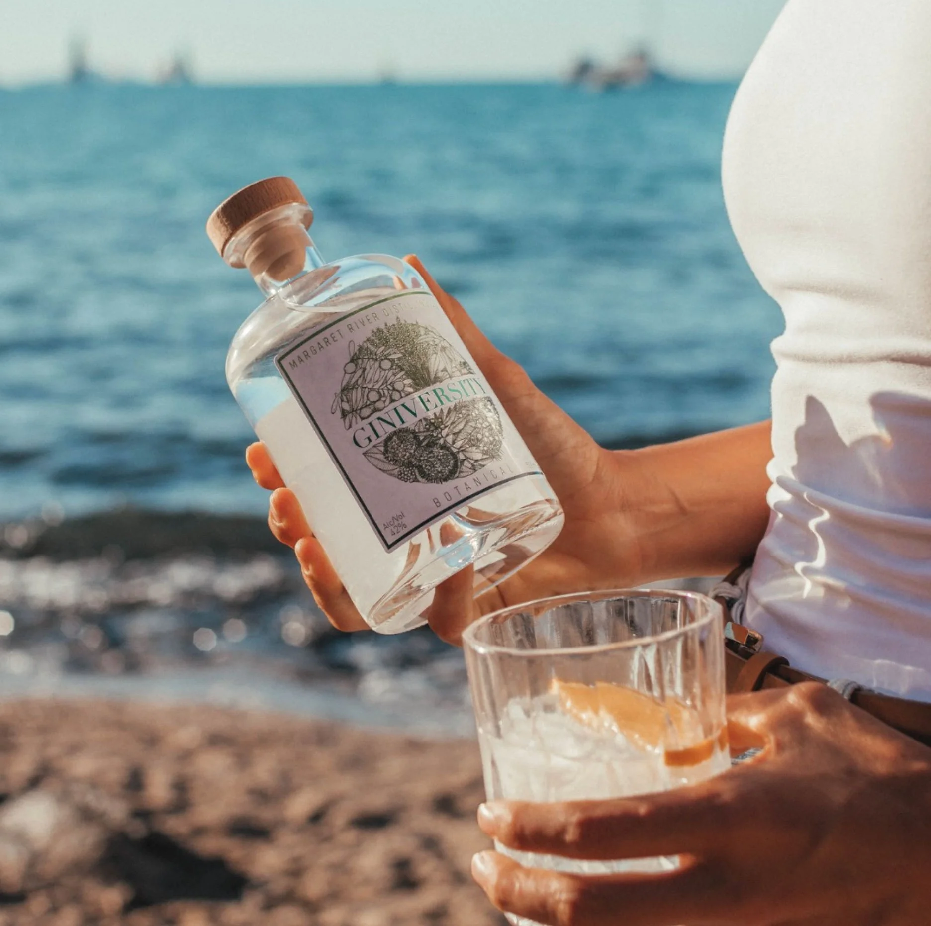
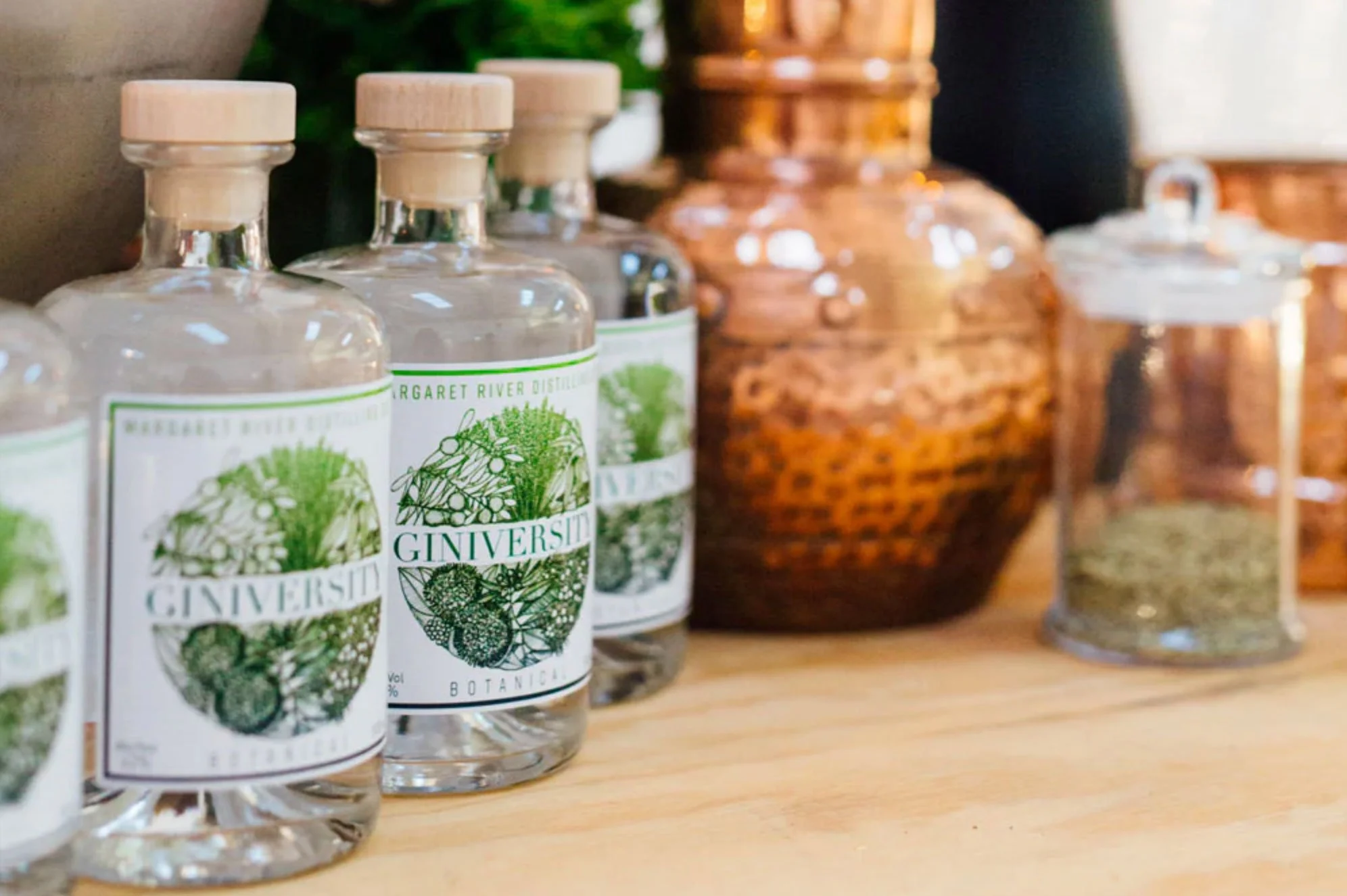
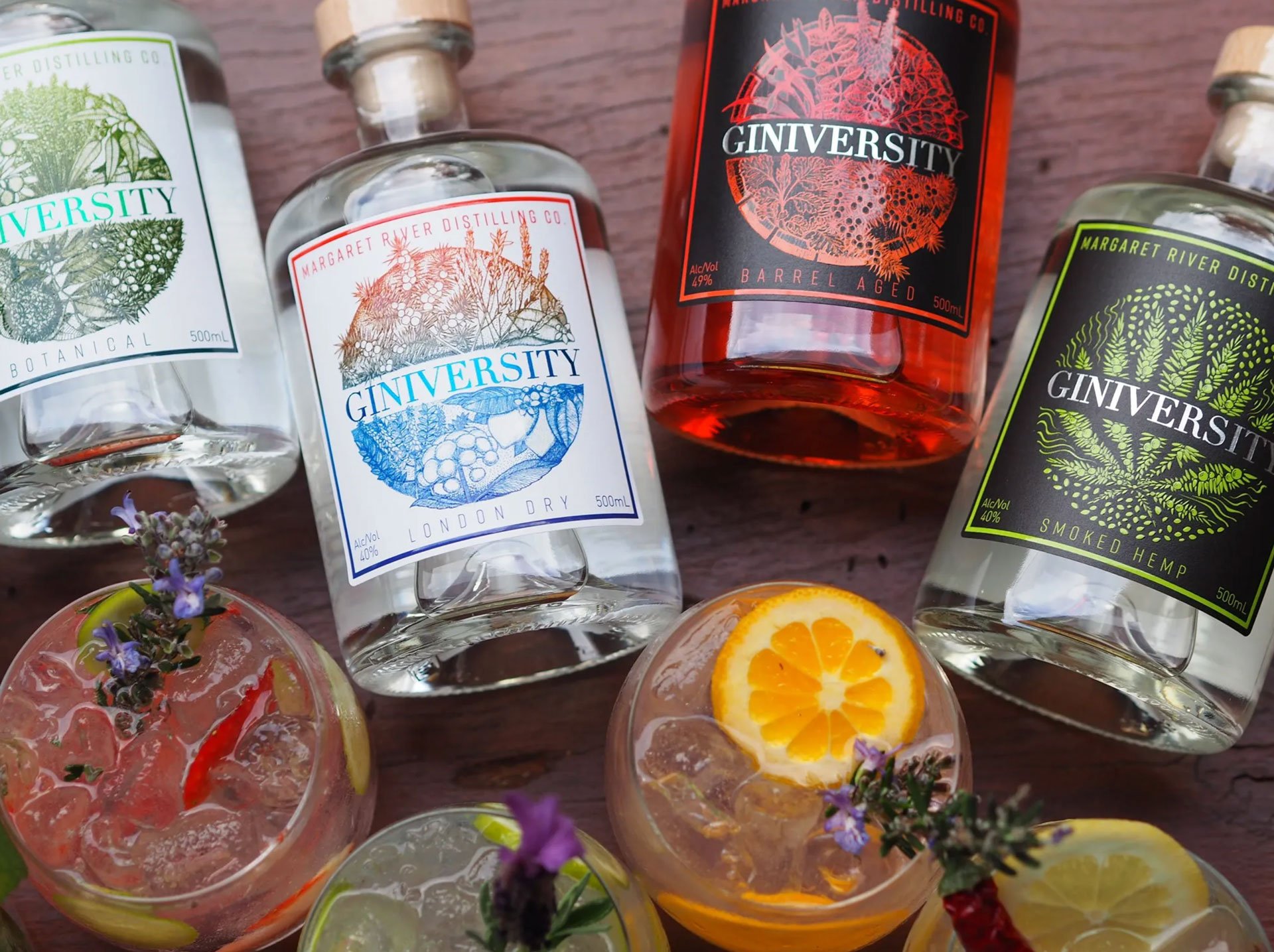
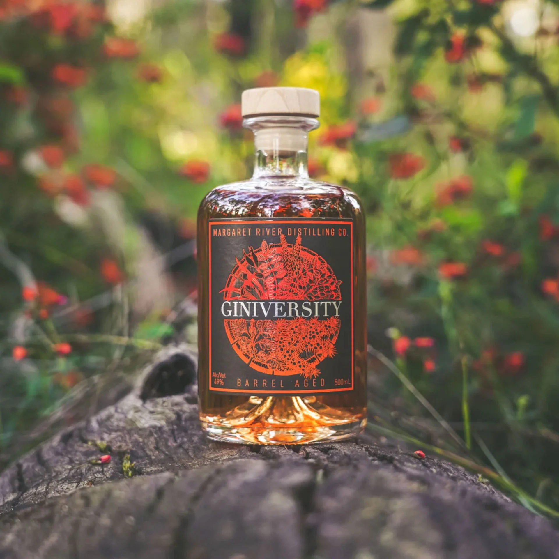
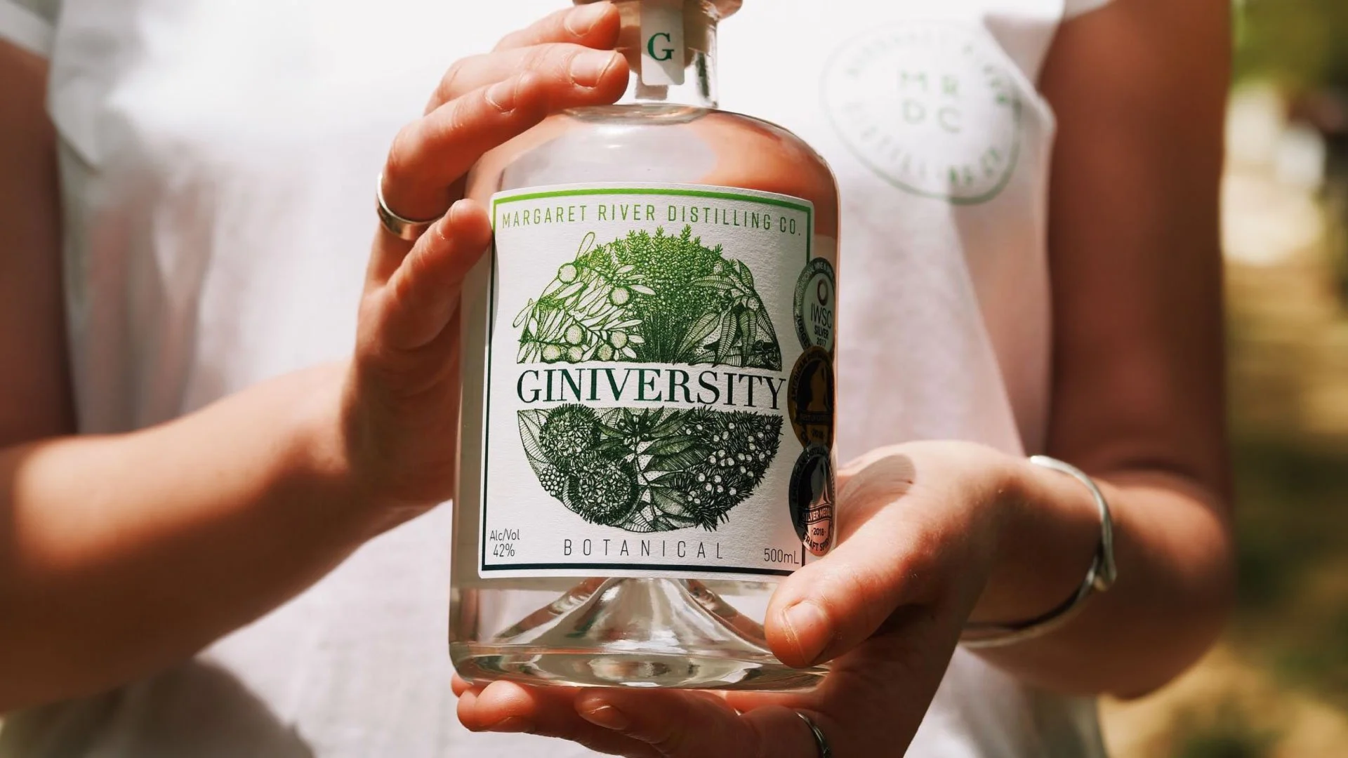
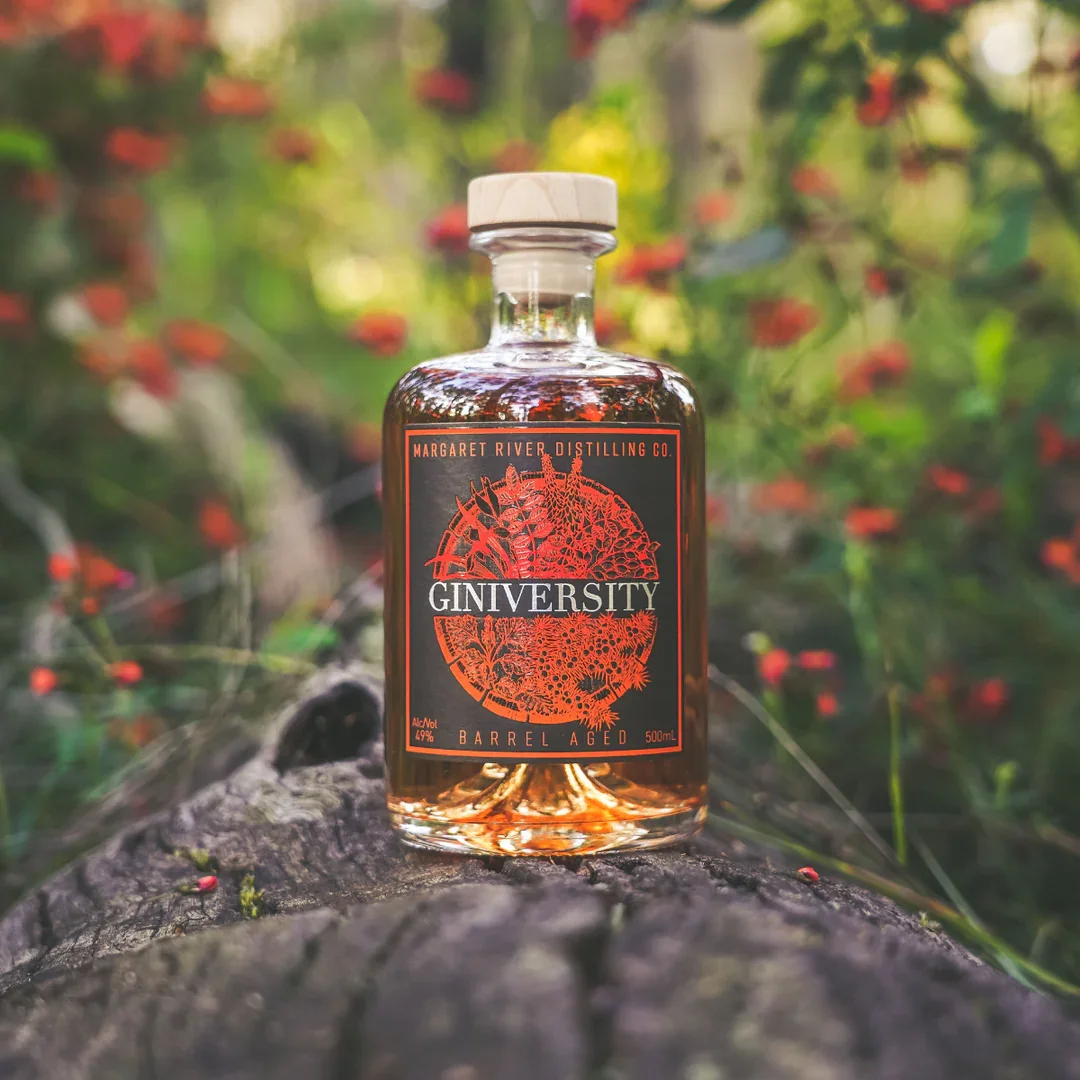
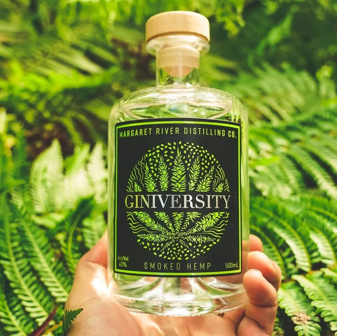
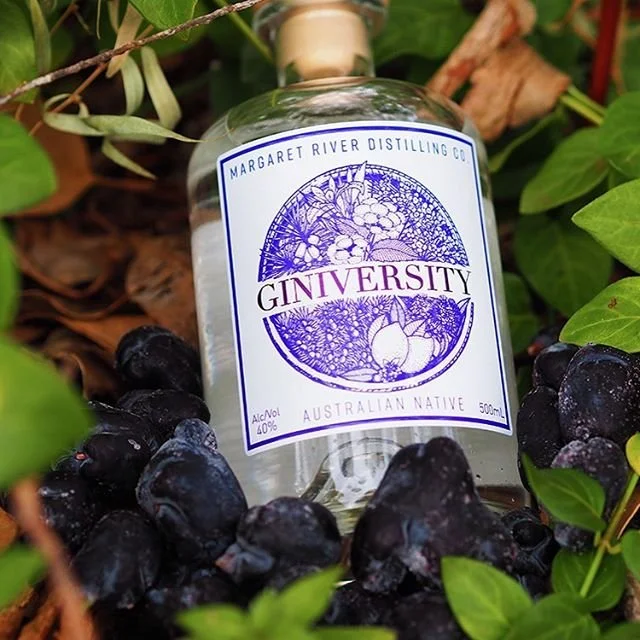
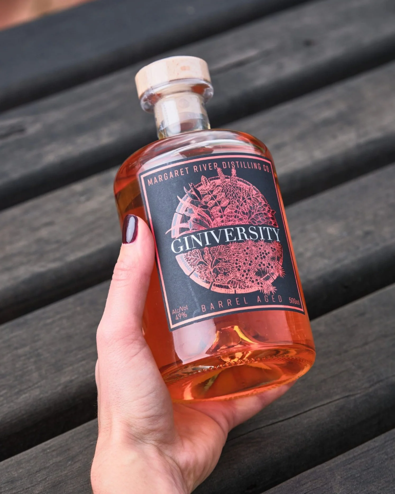
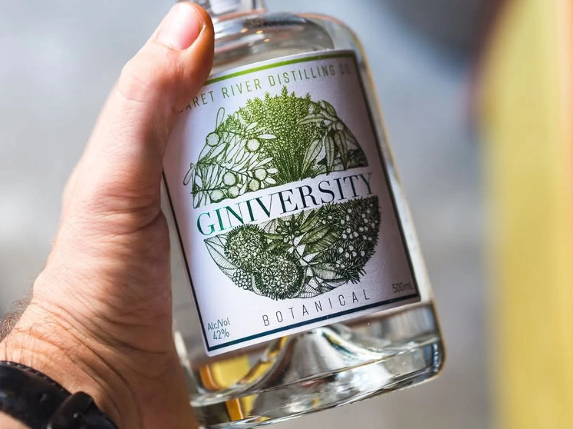
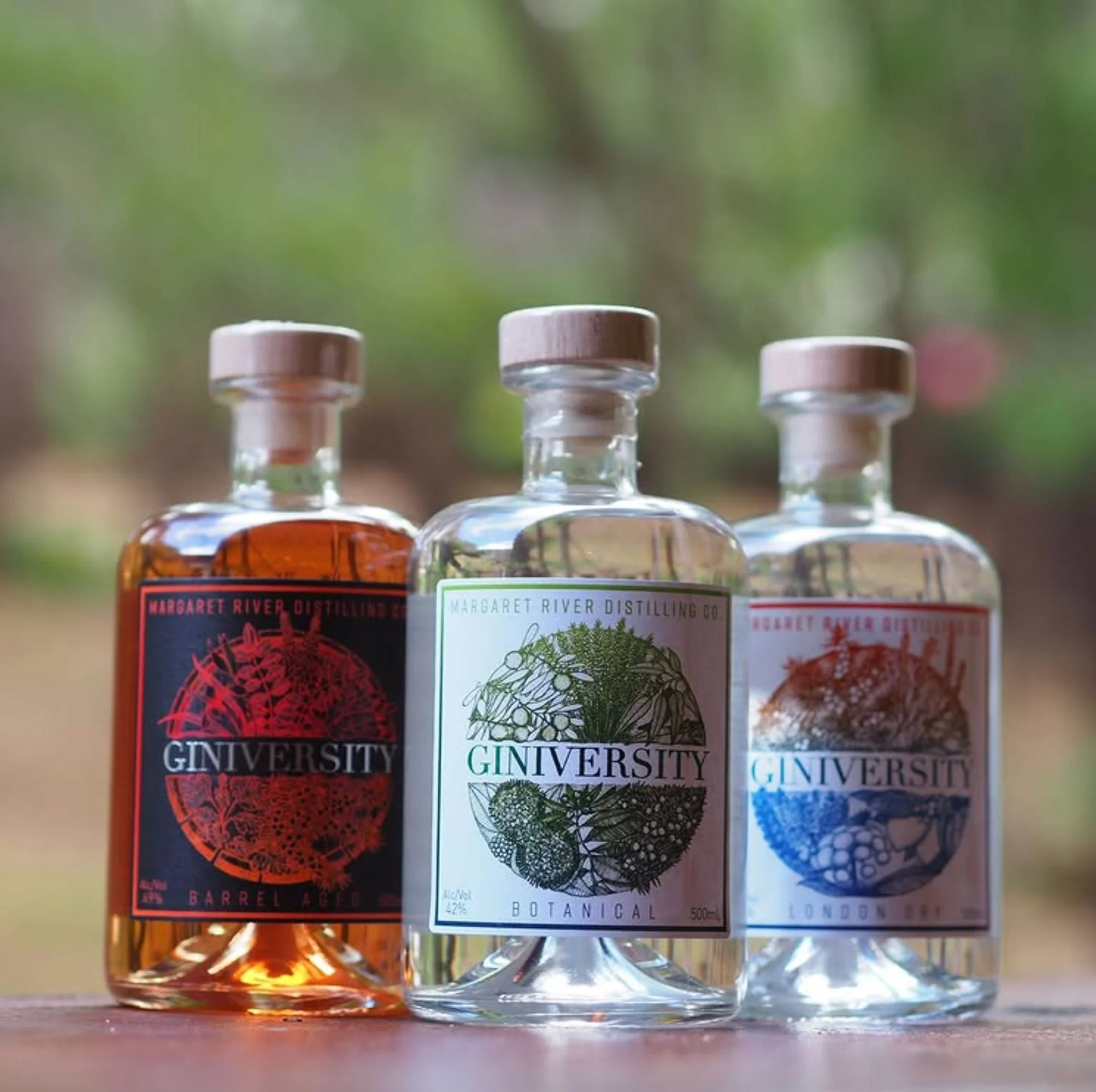
Giniversity was one of the first distilleries I collaborated with, based in Margaret River and born from the Great Southern Distilling Co. The challenge was to create packaging that could hold its own within a growing spirits portfolio, while also supporting Giniversity’s role as both an experience and a destination.
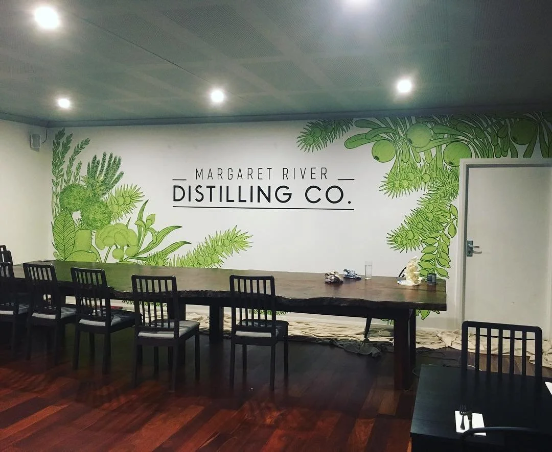
Together, we leaned into illustration as a way to bring personality and storytelling to the range. Each expression was anchored by a bespoke hand drawn illustration, unified through a confident, cohesive framework that felt timeless and unmistakably Giniversity. The label system became central to the brand experience, both on shelf and on site.
A run of industry awards over the years suggests the approach landed well. More importantly, the range continues to stand as proof that when the foundations are right, good design doesn’t date.


Brand Identity
Logo Design
Packaging Design
Illustration
Label Design